Skip to content
Brand Guidelines·v1.7·2026-09

The GINI identity.Iraq's digital commerce infrastructure.

The official guide to how GINI shows up in the world — an Iraqi company automating markets and digital commerce, empowering merchants of all sizes to grow within a unified digital ecosystem. Every asset is free to download.

  • Baghdad · Iraq
  • Registered mark ®
  • 10 logo variants · 5 colours
Primary colour
#F05D25

GINI Orange · Pantone 1655 C

Primary typeface
Rubik

400 · 500 · 700 · 800

Logo variants
10

SVG + PNG formats

Version
v1.7

2026-09

01/16
Foundation

Before we draw the logo — we know what we build

Four pillars that steer our market automation and merchant empowerment ecosystem — guiding every design and editorial decision.

01Mission

We build Iraq's digital commerce infrastructure.

We connect merchants, service providers, delivery networks, and payment systems within a unified digital ecosystem — providing tools for business management, payments, and order handling so every merchant can reach millions efficiently.
02Vision

To empower every merchant to grow digitally.

A digital ecosystem that small merchants adopt as readily as large ones — easing the transition to the digital economy and unlocking broader markets with smart tools and ready-made infrastructure.

03Positioning

Iraq's market automation and digital commerce company.

Not just an online store. We're an integrated ecosystem that fuses payments, logistics, and business management — serving consumers and merchants alike within a transparent, efficient experience.

04Promise

Empower merchants. Simplify commerce.

Advanced digital tools for merchants of every size, strategic partnerships in payments and delivery, and an ecosystem that creates growth opportunities for all.

We are / We are not

  • Digital commerce infrastructure
  • Enablers for merchants of all sizes
  • An integrated payments and delivery ecosystem
  • Partners in business growth
  • Just an online store
  • Disconnected, siloed solutions
  • A consumer-only platform
  • A copy of foreign models
03/16
Anatomy

Logo construction & measurements

The numbers that keep the mark legible and consistent wherever it appears.

1×GSafe area

The grid above visualises the minimum clear space around the mark: the dashed safe area must remain at least one G-height on every side.

  • Clear space
    = 1× G

    Maintain a clear space equal to the G-height on every side.

  • Min. digital size
    24 px

    Smallest on-screen width where the wordmark stays legible.

  • Min. print size
    16 mm

    Any printed medium: cards, envelopes, signage.

  • Aspect ratio
    ≈ 3.1 : 1

    Don't alter the ratio — no stretching or squashing.

04/16
Rules

How to use the logo — and how not to

Two short lists keep the mark sharp: what to always do, and what to never do.

Do

  • Keep a clear space around the mark equal to the height of the G at minimum.
  • Don't render the logo narrower than 24px on screen or 16mm in print.
  • Only use the original orange or the white knocked-out version.
  • On any orange surface — or any tint of it — use only the white version of the logo.
  • Verify background contrast before exporting — check the accessibility table.

Don't

  • Don't rotate or change the orientation of the logo.
  • Never place the black or full-colour logo on an orange surface.
  • Don't replace the colours with anything outside the official palette.
  • Don't stretch or squash the logo — preserve its native proportions.
  • Don't add strokes, shadows, or any effects around the logo.
05/16
Trademark

'GINI' and 'جنّي' are registered trademarks

The name, wordmark, monogram, associated product marks, and brand colours are legally protected intellectual property. No third party may use them without formal reference to us.

© 2023–2026 GINI. All rights reserved. ‘GINI’, ‘جنّي’, the full wordmark, the monogram, and the primary brand colour (Orange #F05D25) are trademarks registered with the Intellectual Property Directorate of the Republic of Iraq. Use, reproduction, or alteration without prior written permission from GINI is prohibited.

  • What's protected

    The names ‘GINI’ and ‘جنّي’, the full wordmark, the monogram (the G-mark), sub-product names such as ‘GINI Market’ and ‘GINI Jumaa’, the primary brand colour (Orange #F05D25), and our signature pattern — all legally protected marks and assets.

  • What's permitted

    Editorial use (press, reviews, news coverage) using the assets exactly as shown in this guide — no modification to form, colour, or proportions. Any commercial use requires prior written permission.

  • What's strictly prohibited

    Registering domains, apps, or companies with names confusingly similar to ‘GINI’, modifying the logo or its colours or stretching it, applying it to unauthorised merchandise or services, or presenting content in a way that implies official GINI affiliation when none exists.

  • Report an infringement

    If you spot unauthorised use of GINI assets, email info@gini.iq with evidence (links, screenshots) and we'll pursue it through legal channels within 72 business hours.

For licensing or permission requests
info@gini.iq
Official reply within 72h
06/16
Colour

The GINI palette

A warm primary anchored by considered neutrals — built for clarity and contrast.

GINI Orange

Primary brand colour — logo, buttons, interactive elements.

#F05D25

Ember

Darker shade for hover states and type on light fills.

#D94E1A

Night Ink

Primary text and headlines on light surfaces.

#1A1A1A

Warm Cream

Primary surface across the site and marketing material.

#FBF6F0

Quiet Sand

Secondary surfaces for cards and section dividers.

#EFE6DB
07/16
Accessibility

Contrast pairs, validated for every use

Every pair below has been measured against WCAG 2.1 — use it without second-guessing.

  • Aa · GINI

    This body text reads clearly.

    AAA
    Ratio
    16.2 : 1

    Default pairing for long-form body copy.

    fg #1A1A1Abg #FBF6F0
  • Aa · GINI

    This body text reads clearly.

    AAA
    Ratio
    14.1 : 1

    Copy set on sand-toned cards.

    fg #1A1A1Abg #EFE6DB
  • Aa · GINI

    This body text reads clearly.

    AA-large
    Ratio
    3.3 : 1

    Large headings and buttons only (18px+). Avoid body copy.

    fg #FFFFFFbg #F05D25
  • Aa · GINI

    This body text reads clearly.

    AA-large
    Ratio
    3.9 : 1

    Ember for headings and display numbers (18px+) on cream. For body-size text use the text-safe orange #B8410F (5.1 : 1).

    fg #D94E1Abg #FBF6F0
  • Aa · GINI

    This body text reads clearly.

    AAA
    Ratio
    17.4 : 1

    Dark mode for product pages and video thumbnails.

    fg #FFFFFFbg #1A1A1A
  • Aa · GINI

    This body text reads clearly.

    AAA
    Ratio
    16.2 : 1

    Warm accent on dark surfaces.

    fg #FBF6F0bg #1A1A1A
08/16
Typography

One typeface. Many voices.

We rely on Rubik across weights to build a clear visual hierarchy across every surface.

  • DisplayHero titles on marketing pages and campaigns.
    32–48 / 1.15·800

    GINI — your trade partner.

  • HeadingSection titles within pages.
    36–48 / 1.15·700

    One marketplace. Everything you need.

  • SubheadingCard titles and mid-level components.
    20–24 / 1.25·600

    Smart shopping, secure payments, fast delivery.

  • BodyParagraphs and general reading copy.
    16–18 / 1.6·400

    We build an Iraqi platform that connects shoppers to the best brands at fair prices, with warranty and after-sales service from a local team.

  • CaptionSection labels and small eyebrow tags.
    12–14 / 1.4·600

    BRAND GUIDE • VERSION 1

09/16
Pattern

Patterns that add personality without stealing focus

Our signature pattern sits behind content to add depth, while keeping text contrast safe.

On cream#FBF6F0
On brand orange#F05D25
On black#0B0B0C
On charcoal#3F3F46
Orange accent on cream#FBF6F0

Quick rules

  • Use the pattern as a secondary surface only; avoid layering it behind long copy.
  • Keep the pattern at ≤25% opacity under text so contrast stays safe.
  • Don't recolour the pattern with any hue outside the official palette.
Download SVG
10/16
Design system
Version 1.0.0 · Precision Instrument

Modern skeuomorphism — an interface with surface, weight and light

This section is the primary reference for how the GINI interface is built visually: philosophy, lighting model, materials, elevation levels, motion and every ready-made component. Every specimen below is live and built from the real classes used on the site.

Every element is built as if it were a real physical object — raised, pressed, engraved or lit — with the restraint of a contemporary digital product.

GINI's interface takes its cues from premium precision equipment: a matte polymer base, raised ceramic panels, anodized-orange controls with visible thickness, and graphite instrument surfaces. The goal is not the leather-and-wood mimicry of 2010 skeuomorphism but an instinctive understanding of what can be pressed and what sits above what — communicated through light, depth and material, never decoration. It is not neumorphism (grey blobs with two shadows), not glassmorphism, and not "just shadows".

Specimen bench

Real components with the real classes — try them.

skeu-btn-*
skeu-input · skeu-chip
ChipSolidNeutralSuccess
skeu-tab / skeu-tab-active
skeu-toggle · skeu-check · skeu-radio
skeu-meter · skeu-track / skeu-fill
2,500+
Active merchants
skeu-panel · skeu-well · skeu-dark · skeu-alert
Raised ceramic panel
Recessed polymer well
Graphite surface
A raised system alert with a semantic edge.

The six principles

1

Real-world physical logic

Before designing any element we ask: if this were a real object, how would it behave? Buttons press, switches slide, fields are recessed, cards sit on the surface, the selected tab is seated in its rail.

2

One light source

Light always comes from the upper-left, slightly frontal. Every shadow and every highlight respects that direction, so the whole interface reads as one object.

3

Restraint over spectacle

Only four material families, only eight elevation levels, grain that is felt rather than noticed. Depth hierarchy matters more than the quantity of shadows.

4

A clear depth hierarchy

Base → recessed functional areas → raised content surfaces → physical controls → floating overlays. Users understand it without thinking.

5

Clarity always wins

Typography stays modern and clean with no text shadows, and information density is preserved. When beauty and legibility conflict, legibility wins — with a premium physical touch.

6

Accessibility is non-negotiable

State is never communicated by shadow alone: a visible focus rim on every control, ARIA on segmented controls and menus, touch targets ≥ 44px, and reduced-motion respected.

Lighting model

Lighting model

A single virtual light, upper-left. Raised surfaces get an inner top highlight (inset 0 1px 0 white), a short contact shadow beneath, and a softer ambient shadow further out. Recessed surfaces invert the logic: a dark inner shadow at the top and a light lip at the bottom.

  • Every shadow is offset downward (positive y); horizontal offsets are negligible.
  • Shadow ink is warm (rgb 37 22 10), never neutral black — it harmonises with the cream base.
  • The lit top edge is mandatory on every raised surface; the bottom edge is slightly darker to reveal thickness.
  • Gradients are allowed only when they describe curvature, light or material — never decorative gradients.

The four materials

Matte polymer

body / .skeu-well

Used for: Page base, recessed trays and wells, input fields

Recipe: Warm cream (oklch 0.962 0.012 72) with a radial light from the upper-left, a faint tonal drift toward the bottom, and a fixed grain layer at 4.5% opacity.

Raised ceramic

.skeu-panel / .skeu-panel-2 / .skeu-rail / .skeu-dialog

Used for: Cards, panels, the navigation rail, dialogs, secondary buttons

Recipe: Vertical gradient from white to warm white, a 1px edge border, an inner top highlight, and contact + ambient shadows according to the elevation level.

Anodized orange

.skeu-btn-primary / .skeu-tile / .skeu-tab-active / .skeu-chip-solid

Used for: The primary button, icon tiles, the active tab, solid badges, the ON switch

Recipe: Gradient from #cc4914 at the top through #c4461a to #b83f16 at the bottom (a slight dome, ≥4.6:1 under white text), #a83c15 border, a 38% white top gloss, a 2px darker bottom band that reveals thickness, and a soft orange outer glow. The pressed state is darker and recessed.

Graphite

.skeu-dark / .skeu-btn-dark

Used for: The footer, code windows, dark CTA blocks and the controls on them

Recipe: Gradient from #2a2624 to #171412 with 1.2% horizontal brush lines, a 10% lit top edge, a dark bottom edge, and a deep far shadow.

Elevation ladder

Only eight levels. Every element lives at the level that matches its role and rises or sinks on interaction.

  1. Recessed
    .skeu-well--skeu-shadow-recessed

    Functional content trays, progress tracks, the soft selected tab

  2. Well
    .skeu-input / .skeu-well-soft--skeu-shadow-well

    Inputs, checkboxes and switches, row lists

  3. Flush
    .skeu-btn-ghost / .skeu-list-item--skeu-shadow-flush

    Menu rows and ghost buttons at rest — they rise on interaction

  4. Raised 1
    .skeu-panel--skeu-shadow-raised-1

    Standard cards, large chips, alerts

  5. Raised 2
    .skeu-panel-2 / .skeu-rail--skeu-shadow-raised-2

    Hero panels, major containers, the header rail, any card on hover

  6. Floating
    .skeu-floating--skeu-shadow-floating

    Dropdowns, floating pills, popovers

  7. Overlay
    .skeu-dialog--skeu-shadow-overlay

    Dialogs above a lightly dimmed backdrop

  8. Pressed
    :active / .skeu-tab-active--skeu-shadow-pressed

    The instant any control is pressed, and the selected tab

Radius scale

  • 6px
    Tiny chips and tags
  • 10px
    Standard buttons, inputs, small controls
  • 14px
    Tiles and tabs
  • 20px
    Cards and panels
  • 26px
    Dialogs and the navigation rail

Motion rules

  • Button press — 80msDrops 1px as the outer shadow turns into an inset; returns within 150ms.
  • Card hover — 260msRises 2px from Raised-1 to Raised-2 on cubic-bezier(0.22, 1, 0.36, 1).
  • Tab selectionThe new tab sinks 1px with a deeper fill; the previous one springs back.
  • SwitchThe thumb slides 20px mechanically over 260ms while the track illuminates.
  • Dropdown — 180msAppears with a small lift and fade (animate-skeu-pop).
  • Dialog — 260msRises from the base with a controlled 0.97 → 1 scale (animate-skeu-dialog).
  • Reduced motionAll motion is disabled under prefers-reduced-motion; states remain readable through shape and colour.

Component catalog

Surfaces
  • skeu-panel
    Raised panel
    The standard card
  • skeu-panel-2
    Raised panel 2
    Major containers and heroes
  • skeu-panel-interactive
    Interactive panel
    A clickable card that rises and seats
  • skeu-panel-selected
    Selected panel
    A locked/selected card pressed in with an accent rim
  • skeu-floating
    Floating surface
    Dropdowns and pills
  • skeu-dialog + skeu-backdrop
    Dialog
    The overlay and its backdrop
  • skeu-rail
    Navigation rail
    The header and sticky toolbars
  • skeu-well / -soft / -accent
    Recessed well
    Functional trays and highlighted rows
  • skeu-dark
    Graphite surface
    Footer and code windows
Controls
  • skeu-btn-primary
    Primary button
    The main action — anodized orange
  • skeu-btn-secondary
    Secondary button
    Matte ceramic button
  • skeu-btn-tint
    Tinted button
    A secondary action with accent identity
  • skeu-btn-ghost
    Ghost button
    Flush until hovered, then rises
  • skeu-btn-destructive
    Destructive button
    Machined red
  • skeu-input
    Input
    A recessed well with an illuminated focus rim
  • skeu-check / skeu-radio
    Checkbox / radio
    An engraved well that lights when set
  • skeu-toggle
    Switch
    Recessed track and physical thumb
  • skeu-tab / skeu-tab-active
    Segmented tab
    A raised key; the active one seated in a deeper fill
Small elements
  • skeu-tile / -soft / -ceramic
    Icon tile
    Anodized / tinted well / white ceramic
  • skeu-chip / -solid / -neutral / -success
    Chip / badge
    Embossed pills with a hairline edge
  • skeu-meter
    Instrument readout
    Stats and KPIs
  • skeu-table / skeu-row
    Table / row
    Raised header, recessed body, tactile rows
  • skeu-alert-*
    Alert
    Elevated system objects with a semantic edge
  • skeu-skeleton
    Skeleton
    Recessed blocks with a light sweep
  • skeu-track / skeu-fill
    Progress track
    Recessed track and anodized fill
  • skeu-divider
    Engraved divider
    A dark line over a light line

State rules

StatePhysical expression
DefaultRaised in its natural material
HoverRises 1–2px with stronger highlight
PressedDrops 1px, inset shadow, deeper fill
FocusA 3px orange illuminated rim — always visible
SelectedSeated in its rail with accent fill + ARIA attribute
Disabled55% opacity, desaturated, no motion
LoadingRecessed skeletons with a sweep, or a spinner inside the control
ErrorRed edge + soft red rim + a text message

Methodology — seven phases

How the whole product was migrated to the new system, and the same method required for any new screen.

  1. 1 — Audit

    Inventory every route, component and repeated pattern before touching a page; understand the product as one system.

  2. 2 — Foundation

    Tokens, materials, lighting model, shadows, borders, radii, motion — all centralised in globals.css.

  3. 3 — Primitives

    Upgrade buttons, inputs, tabs, switches, chips and dialogs before any page.

  4. 4 — Global shell

    The header as a rail, the base background, the graphite footer, the containers.

  5. 5 — Page by page

    Migrate every route including loading, empty and error states, deleting no content and changing no logic.

  6. 6 — Responsive review

    Check 1366px and 390px in Arabic and English: no horizontal overflow, comfortable touch targets, simplified shadows on mobile.

  7. 7 — Polish

    A full consistency audit and a sweep of legacy fragments until everything reads as one team, one system.

Do

  • Start with the material class (skeu-panel, skeu-btn-primary…) then add Tailwind utilities for layout only.
  • Let content (product imagery, numbers, copy) be the hero; surfaces support it.
  • Use logical properties (start/end) and check both the Arabic and English versions.
  • Give every state (hover, pressed, focus, disabled) a clear physical expression.
  • Respect the elevation level that matches the element's role — don't raise everything.

Don't

  • No neumorphism: grey blobs with a light shadow top-left and a dark shadow bottom-right.
  • No leather, wood or heavy image textures — materials are refined and restrained.
  • No decorative gradients without a physical reason, and no ad-hoc shadows outside the tokens.
  • Don't make everything a pill — each object type has its radius.
  • No text shadows, and never trade contrast for softness.
  • No Tailwind rtl:/ltr: variants — each locale has its own <html dir> root; use logical utilities (ps-/pe-/text-start) instead.

Core tokens

The single truth for colours, shadows and timings. No shadows are invented outside it.

app/globals.css
:root {
  --skeu-bg: oklch(0.962 0.012 72); /* Polymer base */
  --skeu-surface: oklch(0.993 0.004 80); /* Ceramic surface */
  --skeu-well: oklch(0.955 0.01 72); /* Recessed well colour */
  --skeu-accent: #f05d25; /* GINI orange */
  --skeu-accent-deep: #c9481a; /* Anodized control edge */
  --skeu-accent-text: #b8410f; /* Text-safe orange (AA body text) */
  --skeu-accent-text-strong: #8f3210; /* Orange text on 13–16% accent tints */
  --skeu-edge-control: oklch(0.62 0.02 66); /* Form-control boundary (≥3:1) */
  --skeu-edge: oklch(0.86 0.018 68); /* Surface edge colour */
  --skeu-highlight: rgba(255,255,255,0.92); /* Lit top edge */
  --skeu-ink: 37, 22, 10; /* Warm shadow ink (RGB) */
  --skeu-shadow-raised-1: inset 0 1px 0 highlight, 0 1px 1px, 0 2px 4px -1px, 0 10px 24px -14px; /* Standard card stack */
  --skeu-shadow-control: inset 0 1px 0 white/38, inset 0 -2px 0 dark/32, 0 1px 2px, 0 6px 14px -6px orange/55; /* Primary control stack */
  --skeu-focus-rim: 0 0 0 2px #fff, 0 0 0 4px --skeu-accent-deep + inset; /* Two-tone focus rim (≥3:1) */
  --skeu-transition-fast / -normal: 150ms / 260ms; /* Press timing / lift timing */
}

Machine-readable references

This same content is available to any AI agent or dev tool at:

Live implementation: app/globals.css · 2026-09

11/16
Component library
64 components · v1.0.0

Ready-made components — copy, paste, ship

64 live components built from the very same classes that run this site. Every card shows the component working, with copy-ready HTML that works in any app — plain HTML, React or Vue — with zero dependencies.

Install in 10 seconds

One line pulls in every skeu-* class and token. Pair it with brand.css for the palette and typeface.

<link> tag
<link rel="stylesheet" href="https://gini.iq/skeu.css">
@import in CSS
@import url("https://gini.iq/skeu.css");
With the palette
<link rel="stylesheet" href="https://gini.iq/brand.css">
<link rel="stylesheet" href="https://gini.iq/skeu.css">
64 componentsZero dependenciesRTL readyHTML · React · Vue · Svelte

The classes work with plain HTML, React, Vue, Svelte or any framework — zero dependencies. RTL is supported automatically via dir="rtl". Layout utilities (h-10, px-4, gap-2…) are Tailwind and can be swapped for your own CSS.

Actions

8

Primary button — three sizes

The anodized button at 32 / 40 / 44px. Size is layout only — the material is the same.

  • skeu-btn
  • skeu-btn-primary
btn-sizes

Button family

Ceramic secondary, tinted, ghost, destructive, and dark for graphite surfaces.

  • skeu-btn-secondary
  • skeu-btn-tint
  • skeu-btn-ghost
  • skeu-btn-destructive
  • skeu-btn-dark
btn-variants

Icon button

A 40px square with only an icon — never without aria-label.

  • skeu-btn
  • skeu-btn-secondary
  • skeu-btn-primary
btn-icon

Button with leading icon

Icon at the start edge, label after it — flips automatically in RTL.

  • skeu-btn
  • skeu-btn-primary
btn-leading-icon

Loading button

A spinner inside the control with aria-busy and pointer disabled.

  • skeu-btn
  • skeu-btn-primary
btn-loading

Disabled button

55% opacity, desaturated, no motion — the disabled attribute is enough.

  • skeu-btn
btn-disabled

Button group / split button

Adjoining keys sharing one radius; the split button separates the main action from its menu.

  • skeu-btn-secondary
  • skeu-btn-primary
btn-group

Floating action button

A raised round button for the screen's main action — lives at the floating level.

  • skeu-btn
  • skeu-btn-primary
  • shadow-floating
fab

Forms

15

Text field with label, help and error

The field is a recessed well; the error state adds is-invalid and a message linked via aria-describedby.

  • skeu-input
  • is-invalid

As printed on your ID.

Enter a valid email address.

field-text

Input with leading icon

The icon is pinned to the start edge with logical properties (start-3 / ps-9).

  • skeu-input
input-icon

Select

A native select inside a recessed well with a hand-drawn chevron on the end edge.

  • skeu-input
select

Textarea

The same well with free height and a character counter below.

  • skeu-input
textarea

Checkbox list

Soft recessed rows; each row is a full label so the touch target is ≥ 44px.

  • skeu-check
  • skeu-well-soft
Notifications
checkbox-list

Radio group

Options as cards; the chosen card is pressed in with an accent rim (skeu-panel-selected).

  • skeu-check
  • skeu-radio
  • skeu-panel
  • skeu-panel-selected
Delivery speed
radio-group

Switch row

A mechanical role=switch with aria-checked; the thumb slides 20px.

  • skeu-toggle
  • skeu-panel
Push notificationsOrder status on your phone
Marketing emailsOffers and new merchants
switch-row

Segmented control

Raised keys inside a well; the active key is seated in a deeper fill (skeu-tab-active).

  • skeu-well
  • skeu-tab
  • skeu-tab-active
segmented

Slider

A native range with accent-color inside a well, with a value readout in a meter.

  • skeu-well
  • skeu-meter
320K
slider

File drop zone

A recessed well with an inner dashed border and an icon tile; the real input is visually hidden.

  • skeu-well
  • skeu-tile-soft
  • skeu-btn-secondary
dropzone

OTP / code row

Six recessed one-character cells, always LTR for digits.

  • skeu-input
otp

Date input

A native input[type=date] in the same well — you get the browser picker for free.

  • skeu-input
date-input

Two-column form layout

A raised panel, one column on phones and two from sm, with the actions in a bottom row.

  • skeu-panel
  • skeu-input
  • skeu-btn-primary
  • skeu-btn-ghost

Shipping address

form-layout

Inline validation summary

A raised error alert above the form listing the failing fields with jump links.

  • skeu-alert
  • skeu-alert-error
validation-summary

Navigation

8

Navbar (rail)

A frosted ceramic rail: logo, links, and the primary action on the end edge.

  • skeu-rail
  • skeu-tab
  • skeu-tab-active
  • skeu-btn-primary
navbar

Breadcrumb

Ceramic chips separated by chevrons; the current page carries aria-current.

  • skeu-chip-neutral
  • skeu-chip
breadcrumb

Tabs — underline and segmented

Underline for pages (a lit line under the active tab), segmented for filters.

  • skeu-divider
  • skeu-tab
  • skeu-tab-soft-active
tabs

Pagination

36px square keys; the current page is seated, previous/next are icon buttons.

  • skeu-tab
  • skeu-tab-active
  • skeu-btn-secondary
pagination

Stepper / progress steps

Done steps are green tiles, the current one anodized, upcoming ones recessed wells — the connector is a progress track.

  • skeu-chip-success
  • skeu-tile
  • skeu-tile-soft
  • skeu-track
  • skeu-fill
  1. 2
  2. 3
stepper

Sidebar list

Flush rows that rise on hover (skeu-list-item); the active item is an accent well.

  • skeu-panel
  • skeu-list-item
  • skeu-well-accent
sidebar

Bottom mobile tab bar

A rail fixed to the bottom with four destinations; the active one is an anodized tile.

  • skeu-rail
  • skeu-tile
  • skeu-tile-soft
bottom-tabs

Back button

A ghost button whose arrow mirrors in RTL through -scale-x-100 under [dir=rtl].

  • skeu-btn
  • skeu-btn-ghost
back-button

Data display

16

KPI tile

An instrument readout (skeu-meter): small label, big tabular number, helper line.

  • skeu-meter
Orders today
1,284
Updated 2 min ago
kpi-tile

Stat row with delta chip

Three readouts in a grid, each with a green or neutral delta chip.

  • skeu-meter
  • skeu-chip-success
  • skeu-chip-neutral
Revenue
48.2M+12%
Orders
3,410+4%
Returns
1.8%±0
stat-delta

Product card

An interactive panel: image in a ceramic tile, badge, IQD price, add-to-cart.

  • skeu-panel
  • skeu-panel-interactive
  • skeu-tile-ceramic
  • skeu-chip-solid
  • skeu-btn-primary
GINI carrying a delivery box-20%

Wireless headphones ANC

89,000 IQD112,000
product-card

Pricing card

A raised-2 panel with a “Most popular” chip, big price, feature list and a primary button.

  • skeu-panel-2
  • skeu-chip-solid
  • skeu-btn-primary
Most popular
GINI Plus
15,000IQD / month
  • Free delivery on every order
  • Priority support
  • 2× loyalty points
pricing-card

Feature card

An anodized icon tile, title, short body — the basic unit of any features grid.

  • skeu-panel
  • skeu-tile

Same-day delivery

Order before 2 pm and receive it tonight anywhere in Baghdad.

feature-card

Testimonial card

Quote, stars, and the speaker row with a ceramic avatar.

  • skeu-panel
  • skeu-tile-ceramic
“Ordered at noon, it was at my door by seven. Never using another app.”
SASara A.Basra · verified buyer
testimonial

User card + avatar group

A two-letter avatar, name and role, and a stacked avatar group with white rings.

  • skeu-panel
  • skeu-tile
  • skeu-tile-ceramic
  • skeu-chip-neutral
AHAli HassanMerchant · KarradaAdmin
MKRSZA+6
user-card

Table with header, rows and actions

skeu-table: a raised sticky header, recessed body, rows that light up on hover with an accent edge.

  • skeu-table
  • skeu-chip-success
  • skeu-chip
  • skeu-btn-ghost
OrderCustomerStatusTotal
#48213Sara A.Delivered89,000
#48212Omar K.Shipping142,500
table

Description list

Key/value pairs in a soft well with engraved dividers — for order details and invoices.

  • skeu-well-soft
Order
#48213
Placed
12 Sep 2026, 14:02
Payment
Qi Card •• 4821
Total
89,000 IQD
description-list

Timeline

A column of nodes: done (green), current (anodized), upcoming (well).

  • skeu-chip-success
  • skeu-tile
  • skeu-tile-soft
  • skeu-divider
  1. Order confirmed
    14:02
  2. Being packed
    Now · Merchant: TechZone
  3. Out for delivery
timeline

Badges and chips

Four materials: tinted, solid, neutral, success — plus a counter chip and a dismissible chip.

  • skeu-chip
  • skeu-chip-solid
  • skeu-chip-neutral
  • skeu-chip-success
NewFeaturedDraftVerified99+Basra
badges

Progress bar + circular progress

A recessed track with an anodized fill; the ring is an SVG in the same colour with a readout in the middle.

  • skeu-track
  • skeu-fill
Uploading68%
68%
progress

Meter / gauge

A semicircle inside an instrument readout — for satisfaction, capacity or quotas.

  • skeu-meter
72%
Fleet capacity
gauge

Empty state

A recessed well with a dashed inner border, a tinted icon tile, short copy and one action.

  • skeu-well
  • skeu-tile-soft
  • skeu-btn-primary

Your cart is empty

Browse 2,500+ merchants and add something you love.

Start shopping
empty-state

Skeleton set

Recessed blocks with a light sweep, in the same geometry as the card they stand in for.

  • skeu-panel
  • skeu-skeleton
skeleton

Feedback & overlays

9

The four semantic alerts

A raised system object with a coloured start edge — success, error, warning, info.

  • skeu-alert
  • skeu-alert-success
  • skeu-alert-error
  • skeu-alert-warning
  • skeu-alert-info
Saved. Your address is now the default.
Low stock. Only 3 left at this price.
Heads up. Deliveries pause during Friday prayer.
alerts

Toast

A short floating notice with icon, action and dismiss; enters with animate-skeu-pop.

Live
  • skeu-floating
  • skeu-chip-success
  • animate-skeu-pop
Added to cartWireless headphones ANC
toast

Inline banner

A full-width accent well for in-page announcements, with a link and dismiss.

  • skeu-well-accent

Free delivery on orders above 50,000 IQD until Friday. Details

banner

Modal dialog (live)

A dimmed backdrop + overlay panel with animate-skeu-dialog; Escape closes and focus is trapped inside.

Live
  • skeu-backdrop
  • skeu-dialog
  • animate-skeu-dialog
  • skeu-btn-primary
  • skeu-btn-secondary
dialog

Dropdown menu (live)

A floating surface with animate-skeu-pop, role=menuitem rows that rise on hover, and a red destructive item.

Live
  • skeu-floating
  • skeu-list-item
  • animate-skeu-pop
  • skeu-divider
dropdown

Tooltip

A small graphite surface above the trigger, linked via aria-describedby.

  • skeu-dark
Delivery fees explained
tooltip

Popover

A floating surface with rich content (title, body, action) tied to a trigger with aria-expanded.

  • skeu-floating
  • animate-skeu-pop
  • skeu-btn-tint
Balance
2,480 pts

Redeem 1,000 pts for 5,000 IQD off your next order.

popover

Confirm dialog (live)

The same dialog with a warning tile and a red destructive button — for irreversible actions.

Live
  • skeu-backdrop
  • skeu-dialog
  • animate-skeu-dialog
  • skeu-btn-destructive
confirm

Bottom sheet (live)

A dialog pinned to the bottom of the screen with a drag handle — for phones.

Live
  • skeu-backdrop
  • skeu-dialog
  • animate-skeu-dialog
bottom-sheet

Commerce

8

Order status pills

The four standard GINI states: preparing, out for delivery, delivered, cancelled.

  • skeu-chip
  • skeu-chip-solid
  • skeu-chip-success
  • skeu-chip-neutral
PreparingOut for deliveryDeliveredCancelled
order-status

Cart line item

Thumbnail, name, variant, quantity stepper, line price and a ghost remove button.

  • skeu-panel
  • skeu-tile-ceramic
  • skeu-btn-secondary
  • skeu-btn-ghost
Wireless headphones ANC
Black · 1 year warranty
2
178,000 IQD
cart-line

Price + discount

The current price is bold, the old one struck through, and the discount lives in a success chip.

  • skeu-chip-success
89,000 IQD112,000Save 23,000

Or 3 × 29,667 IQD with installments

price

Quantity stepper

Two ceramic keys around a readout well; the minimum disables the decrease key.

  • skeu-btn-secondary
  • skeu-input
1
qty-stepper

Delivery timeline

Three horizontal stops with a progress track between them — the mobile form of the timeline.

  • skeu-panel
  • skeu-chip-success
  • skeu-tile
  • skeu-tile-soft
  • skeu-track
  • skeu-fill
Order #48213Arrives today
ConfirmedOn the wayDelivered
delivery-timeline

Merchant header card

Logo in a ceramic tile, name, verified chip, rating, and a follow button.

  • skeu-panel-2
  • skeu-tile-ceramic
  • skeu-chip-success
  • skeu-btn-primary
TZ

TechZone

Verified
4.8· 1.2K orders · Karrada
merchant-header

Payment method row

Payment options as radio cards: Qi Card, ZainCash, cash on delivery.

  • skeu-panel
  • skeu-panel-selected
  • skeu-check
  • skeu-radio
  • skeu-tile-ceramic
Payment method
payment-row

Coupon / loyalty points chip

A coupon field with an apply button, and an anodized loyalty chip with a tabular balance.

  • skeu-input
  • skeu-btn-tint
  • skeu-chip-solid
  • skeu-chip
2,480 ptsWELCOME10 · -10%
coupon

Machine-readable reference

This same library — names, classes and HTML snippets — is available to any AI agent through brand.json and brand.md, and is embedded in brand-prompt.md, cursorrules and AGENTS.md.

12/16
Mascot

GINI — the face of the brand

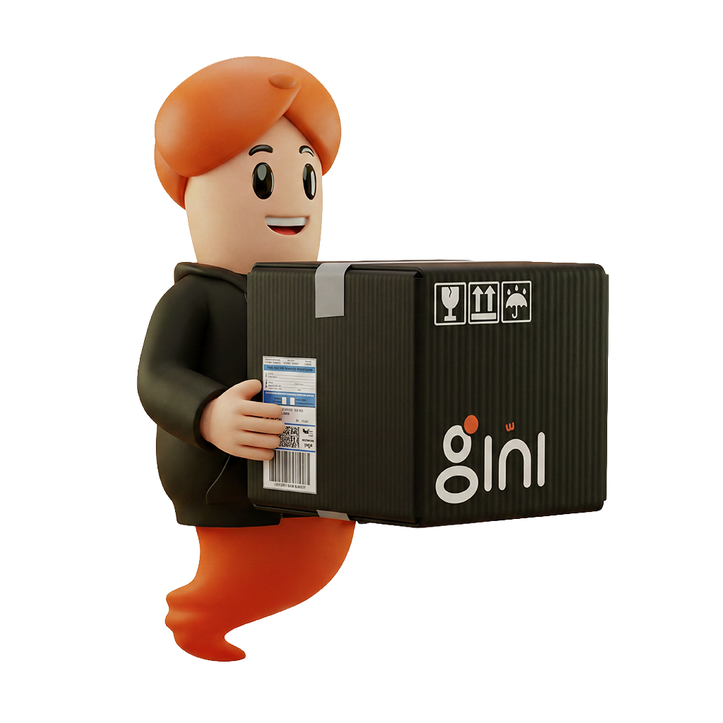
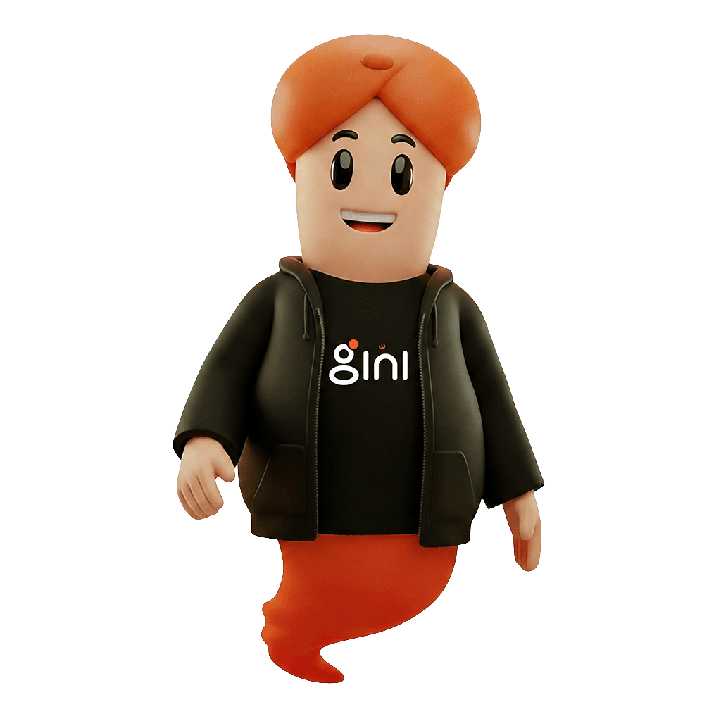
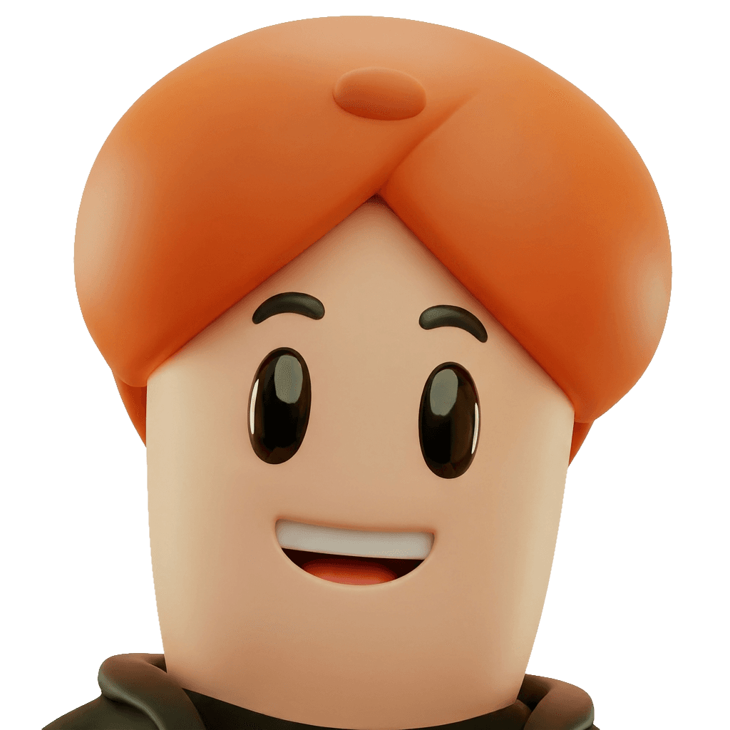
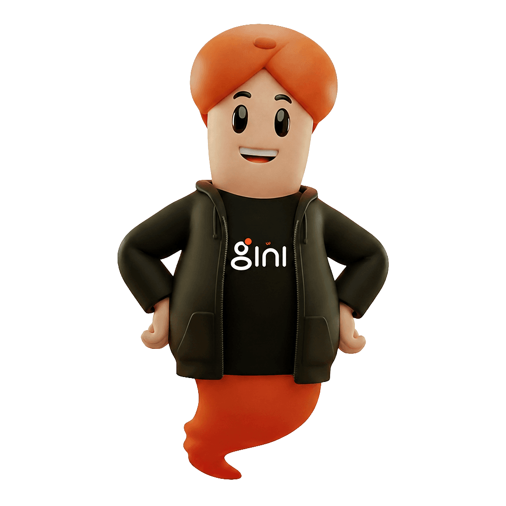
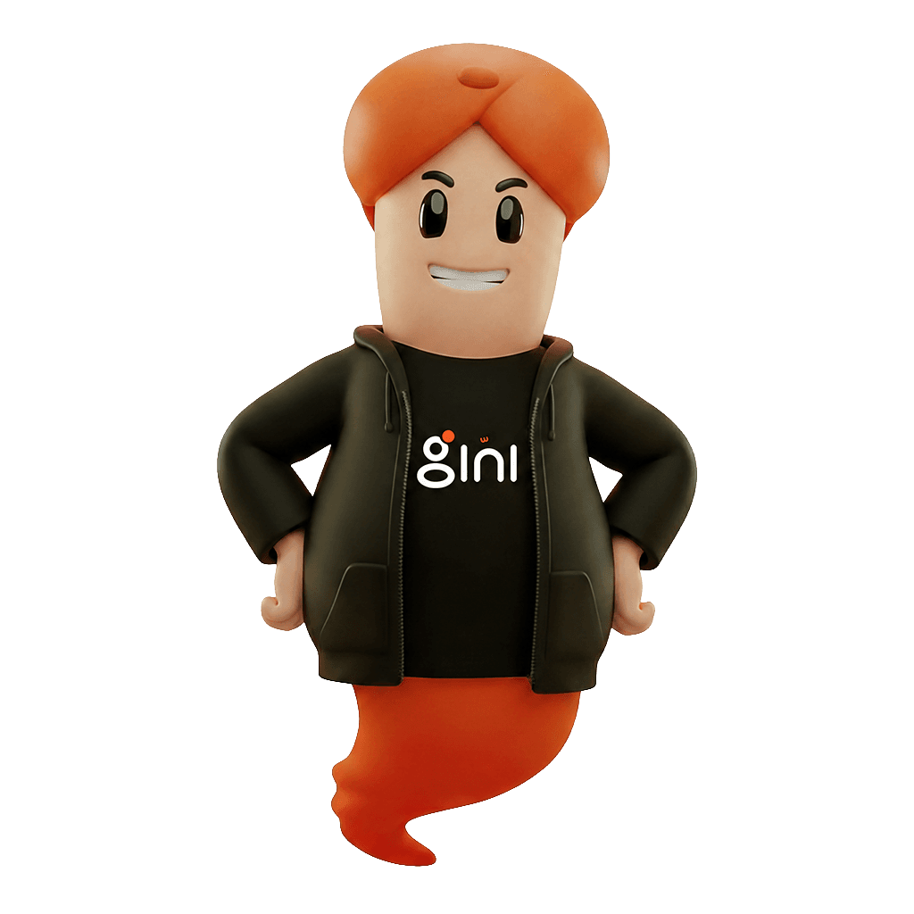
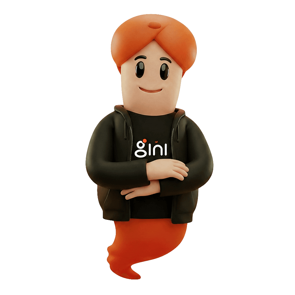
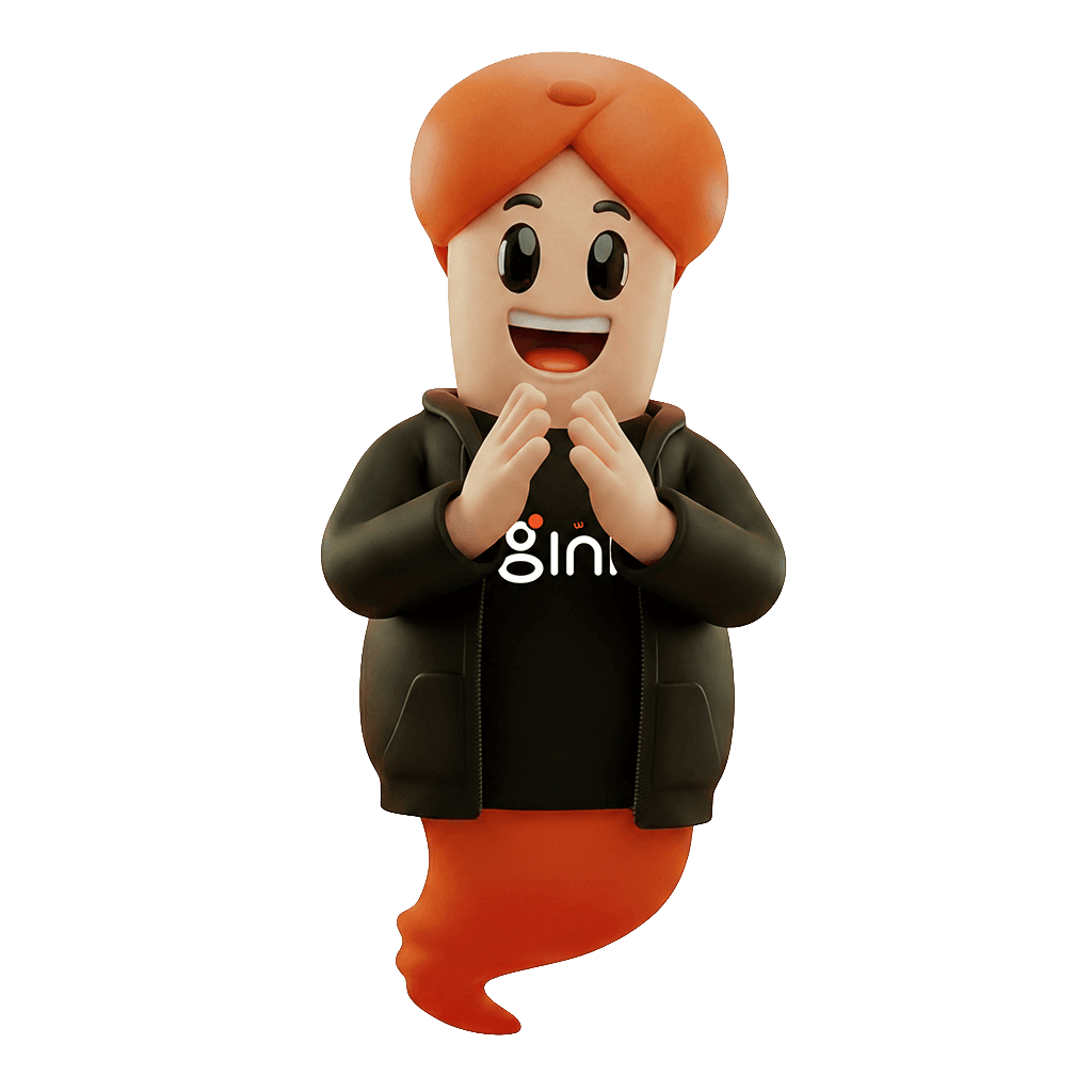
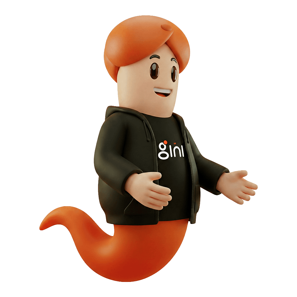
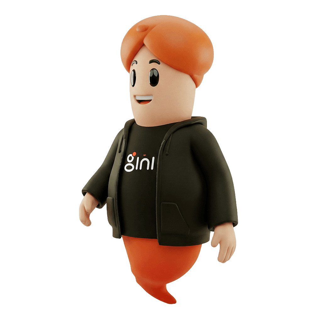
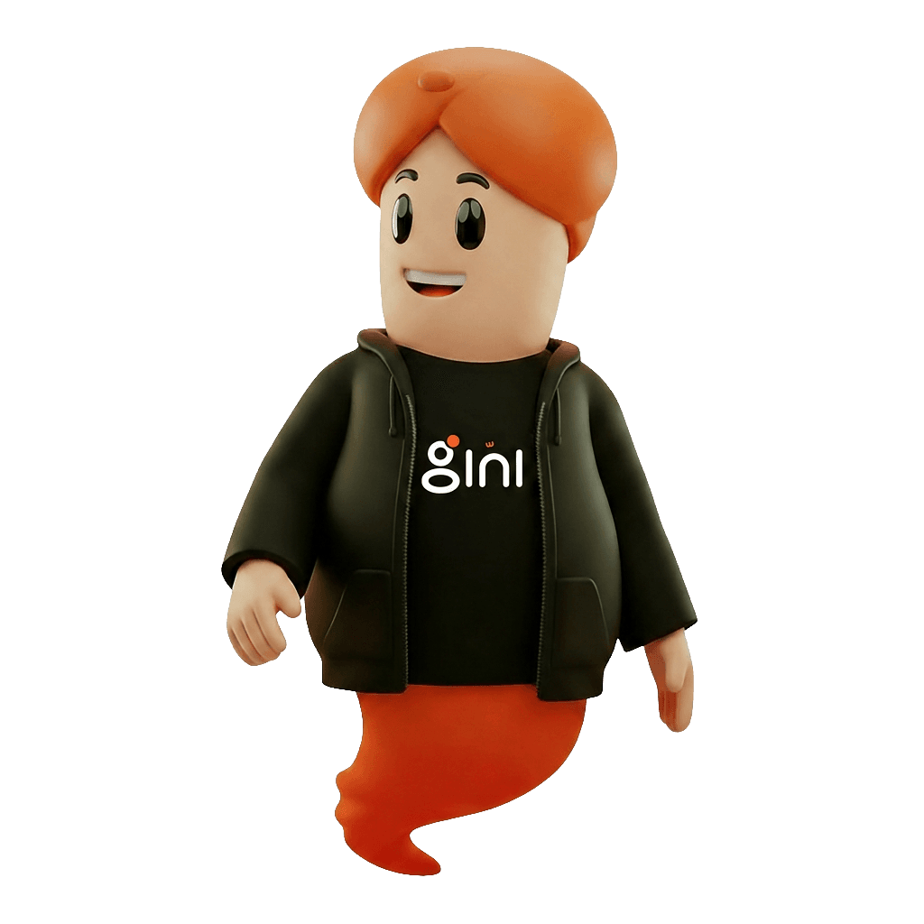
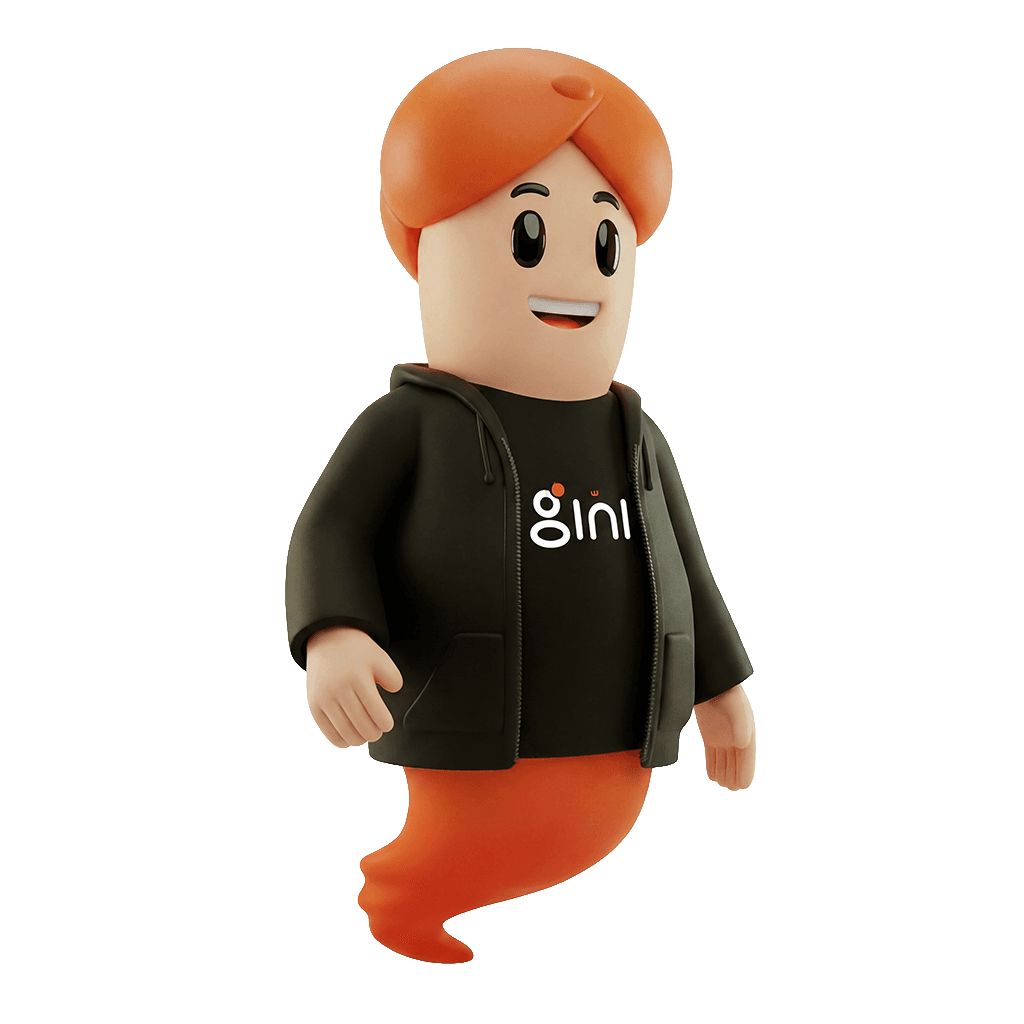
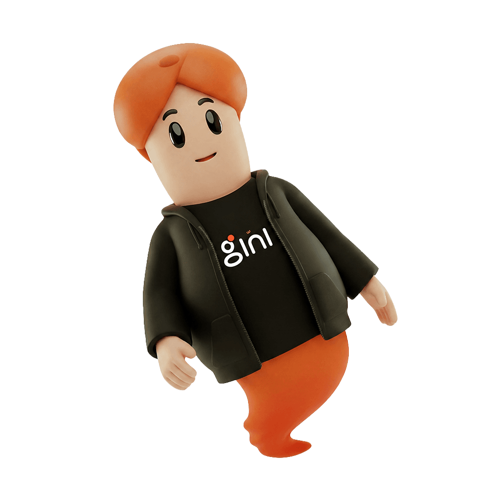
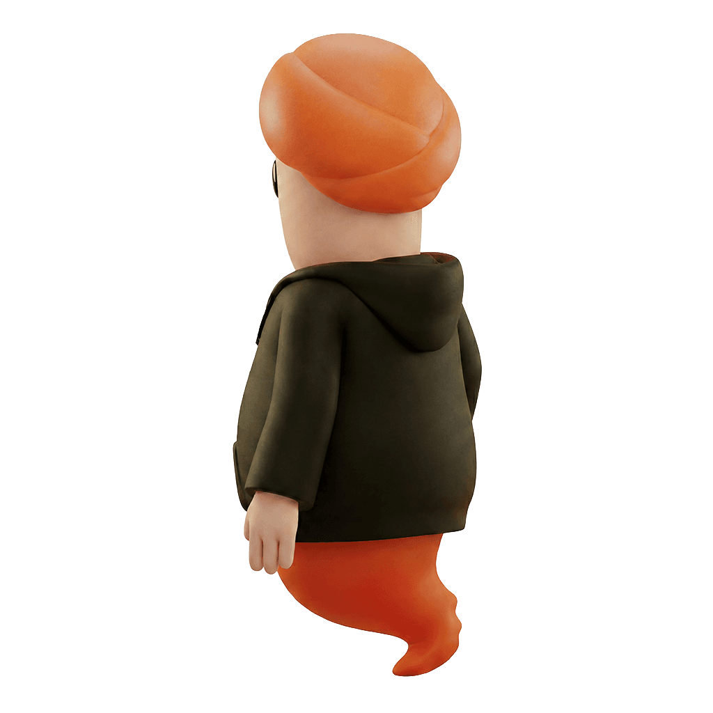
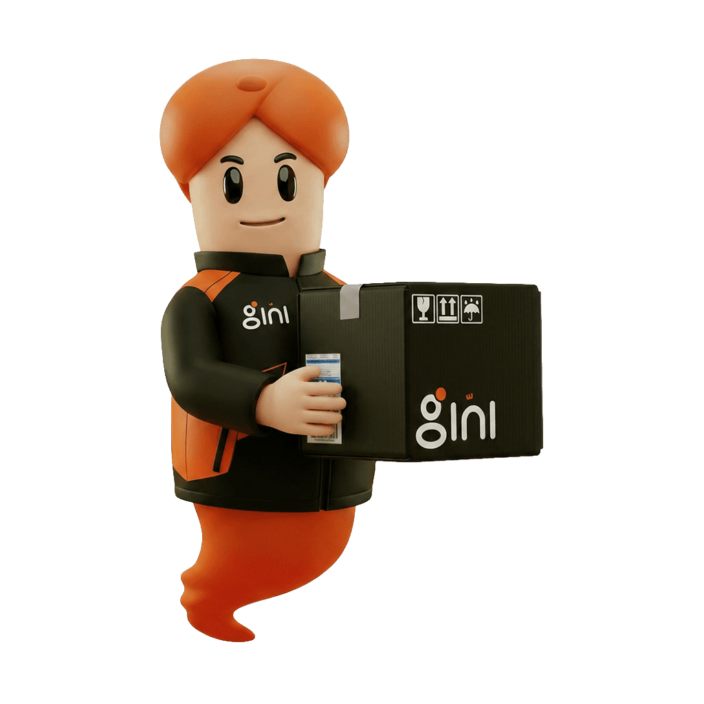
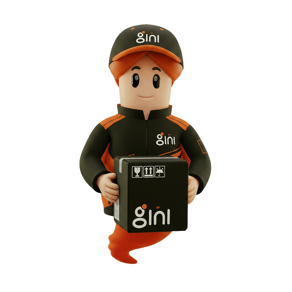
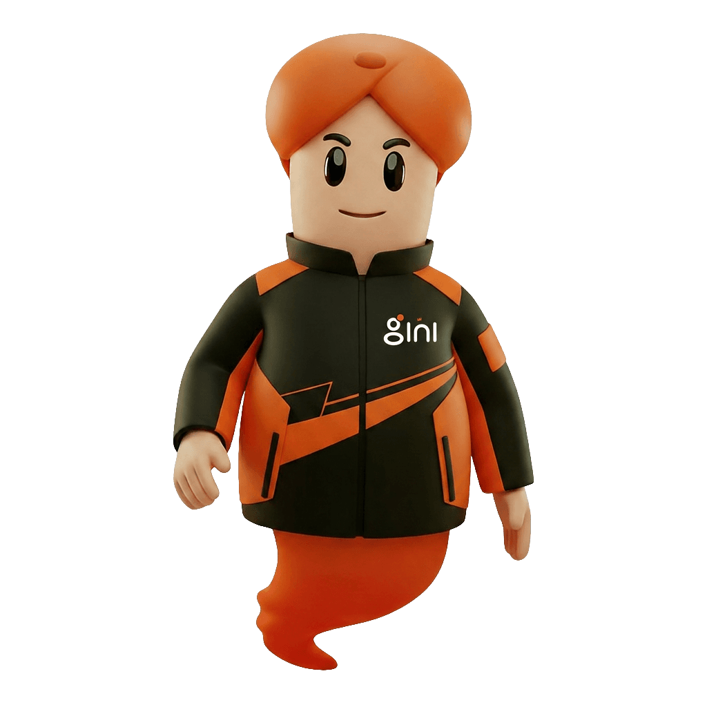
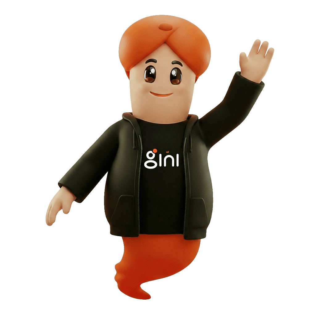
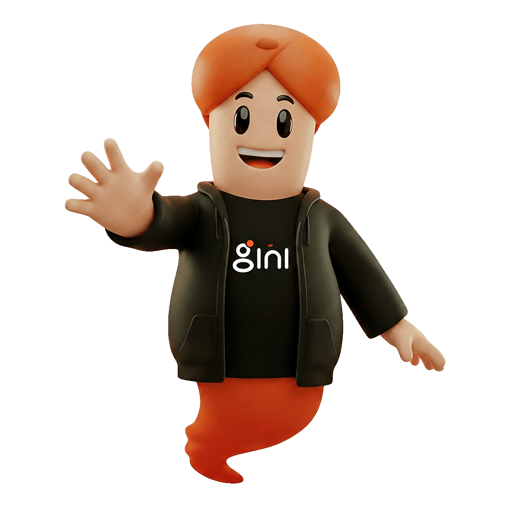
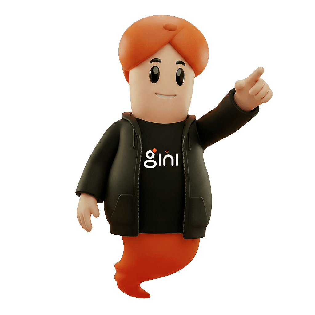
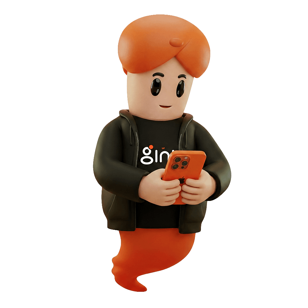
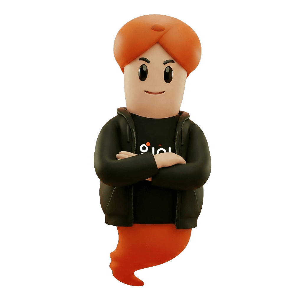
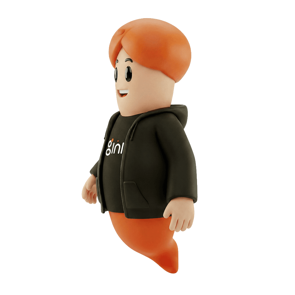
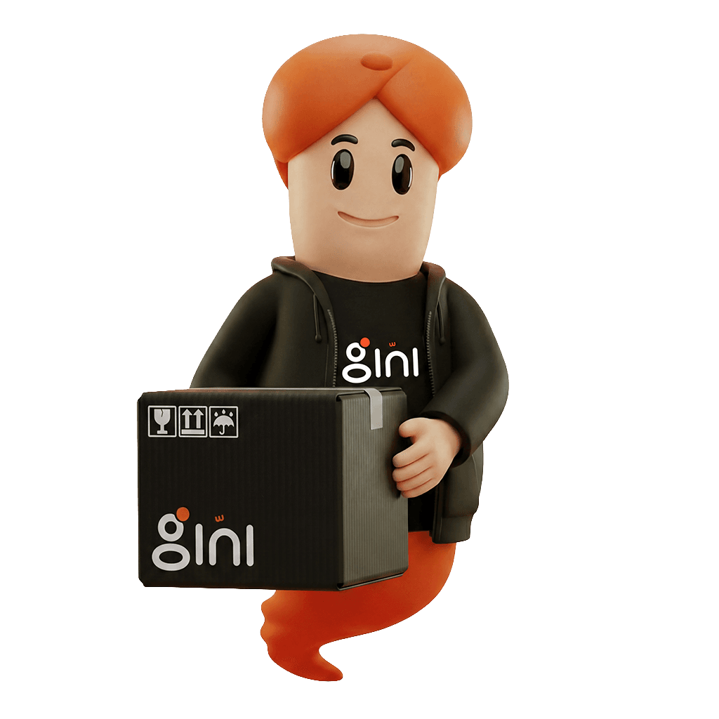
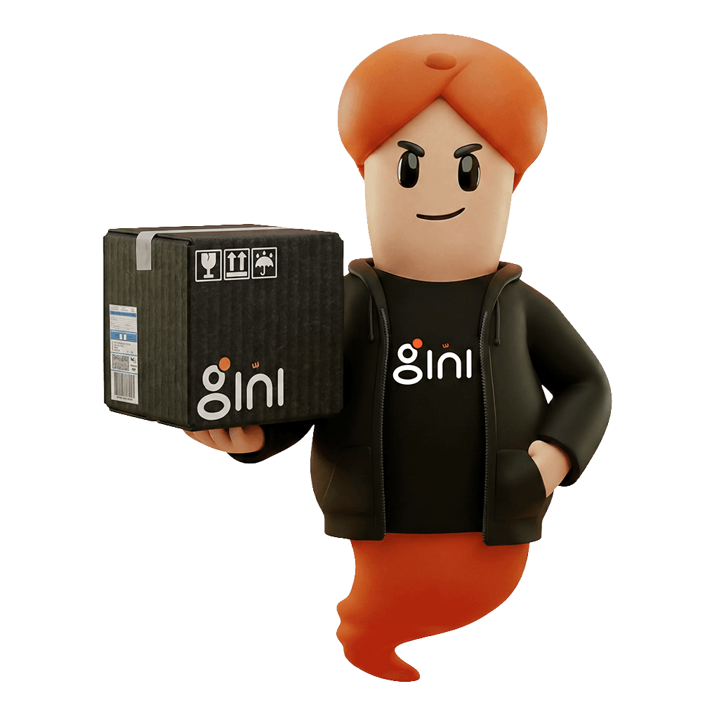
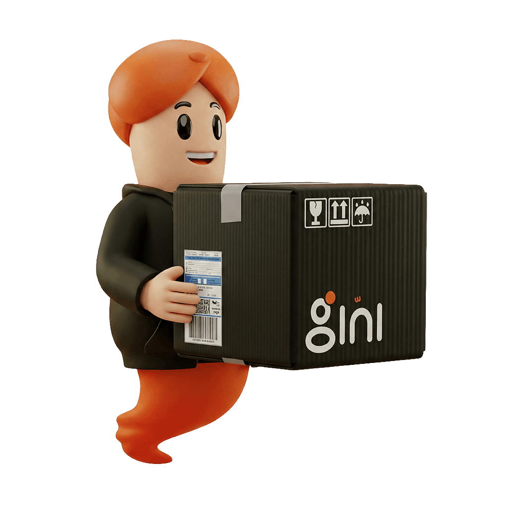
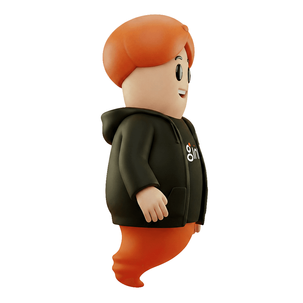
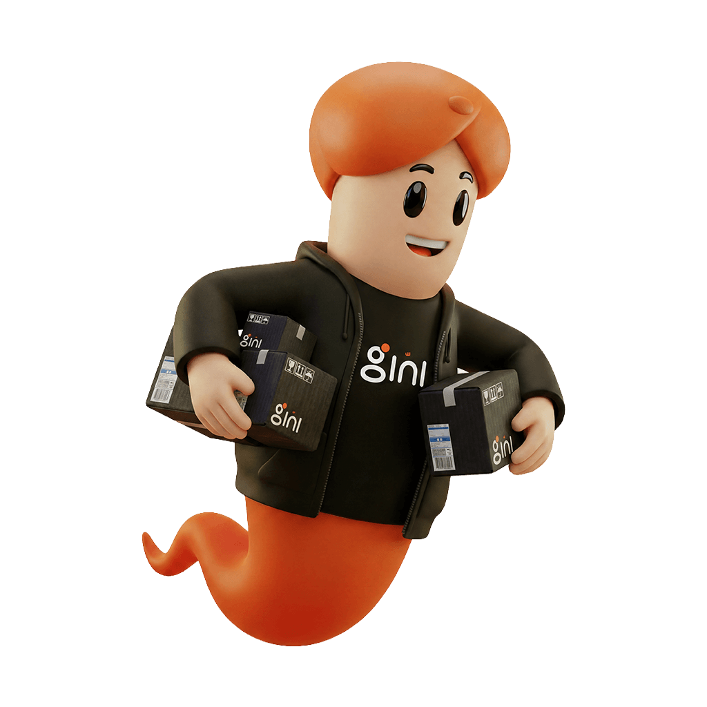
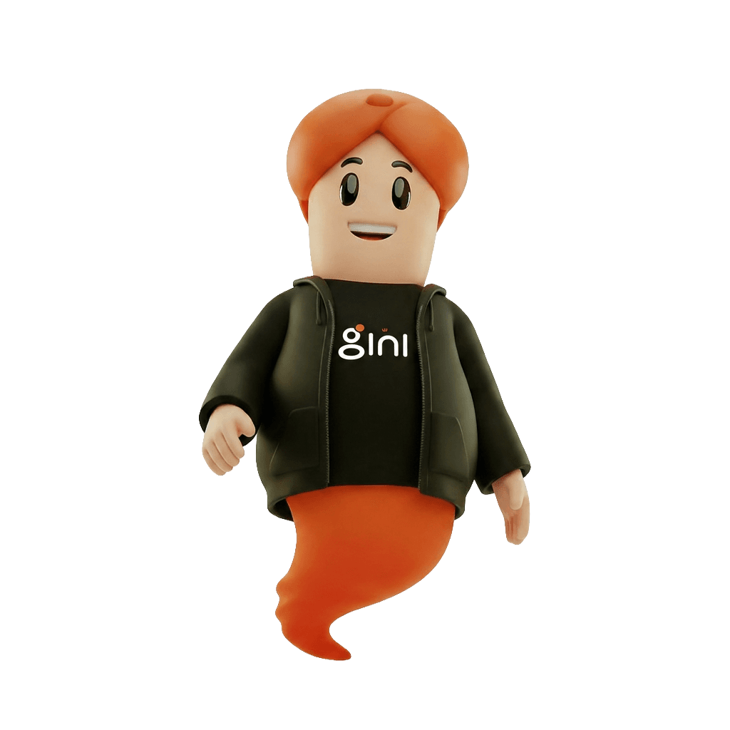
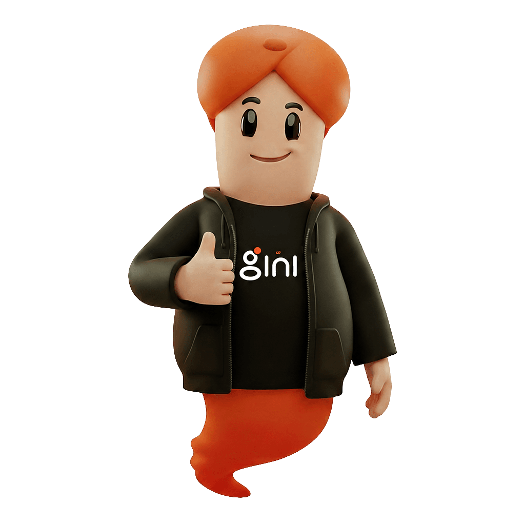
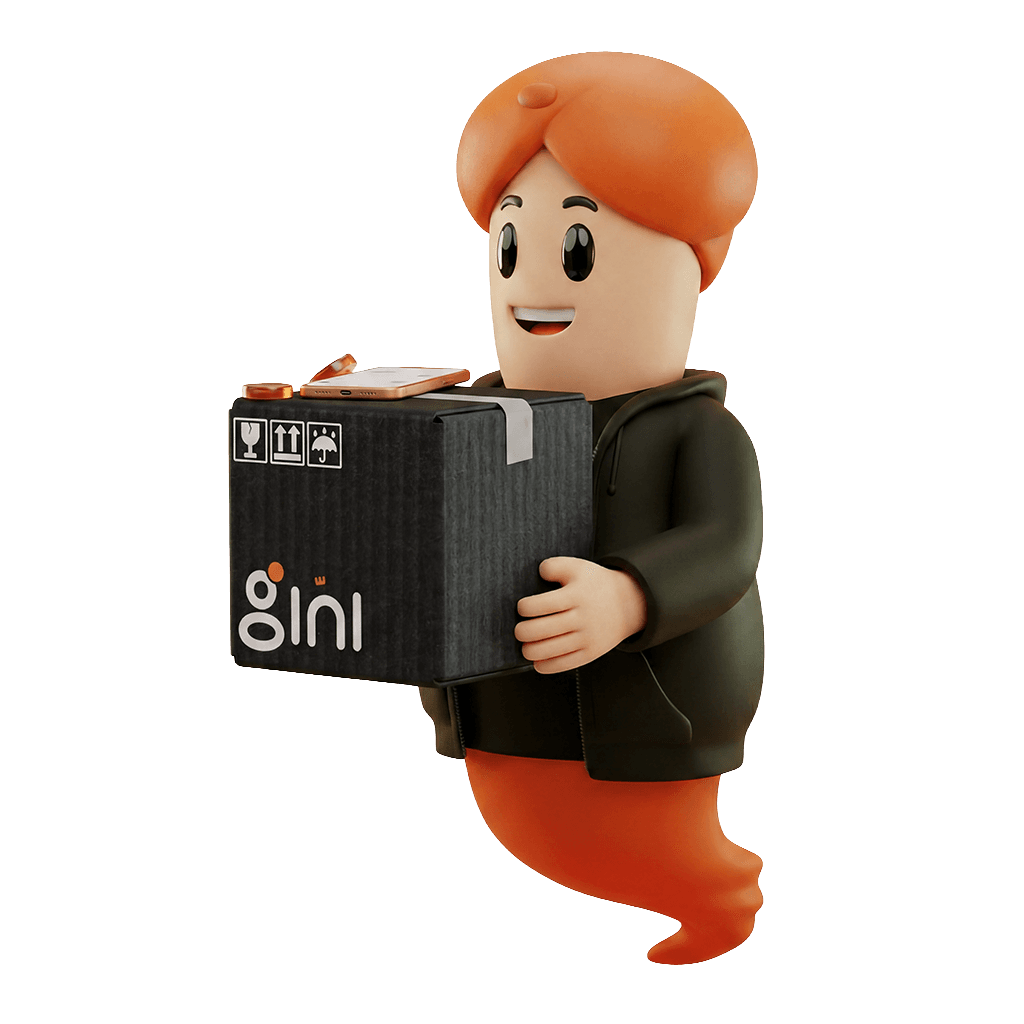
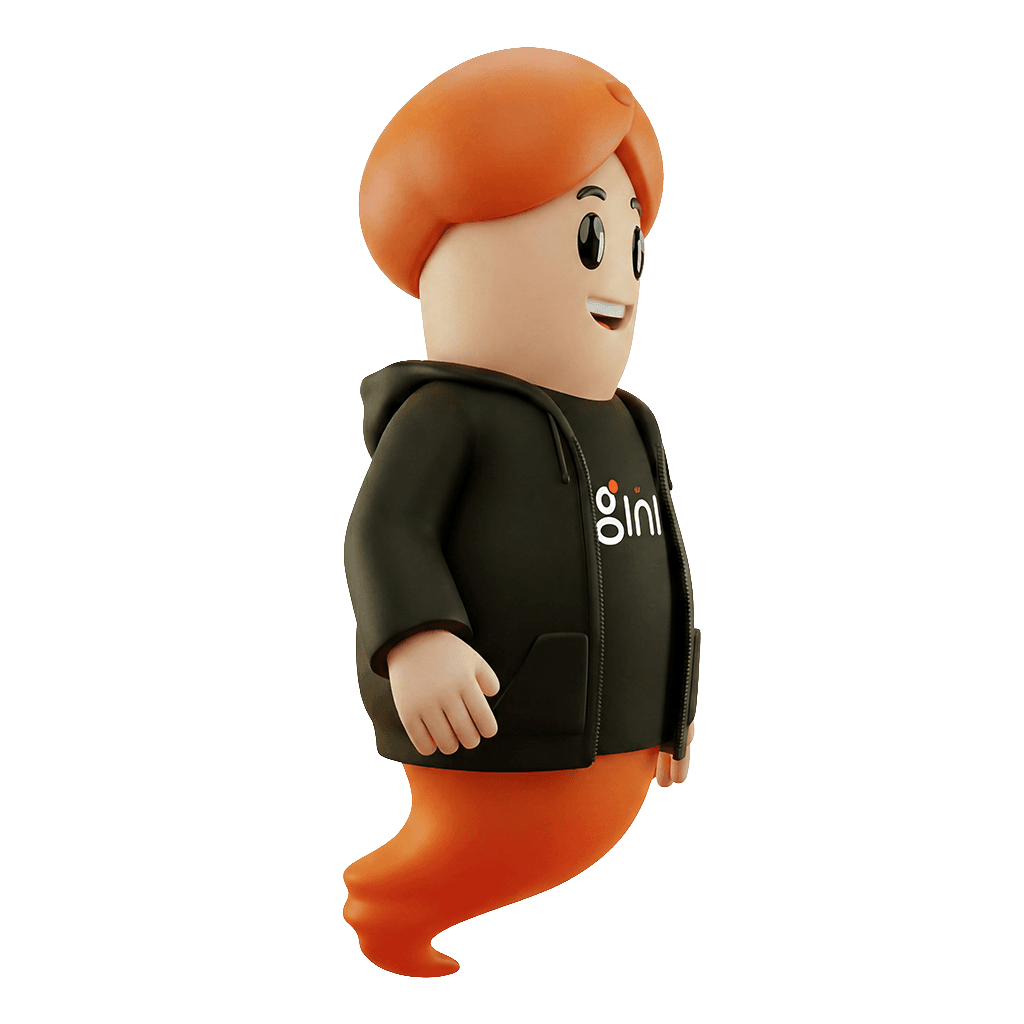
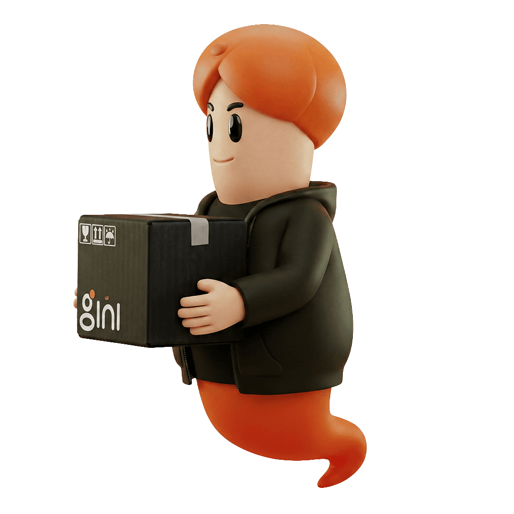
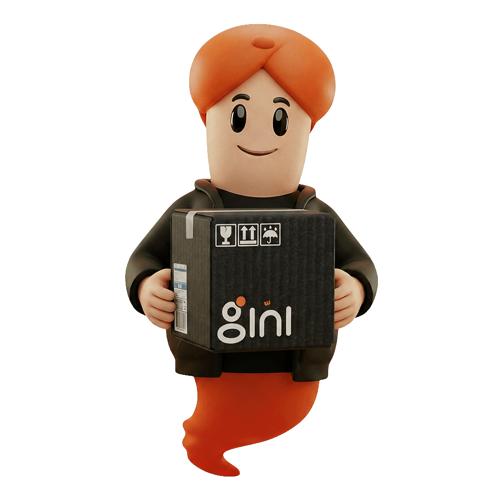
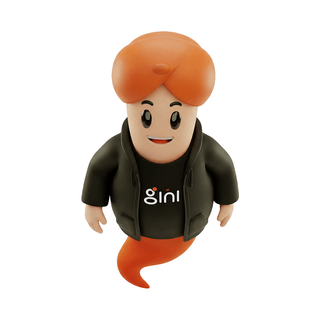
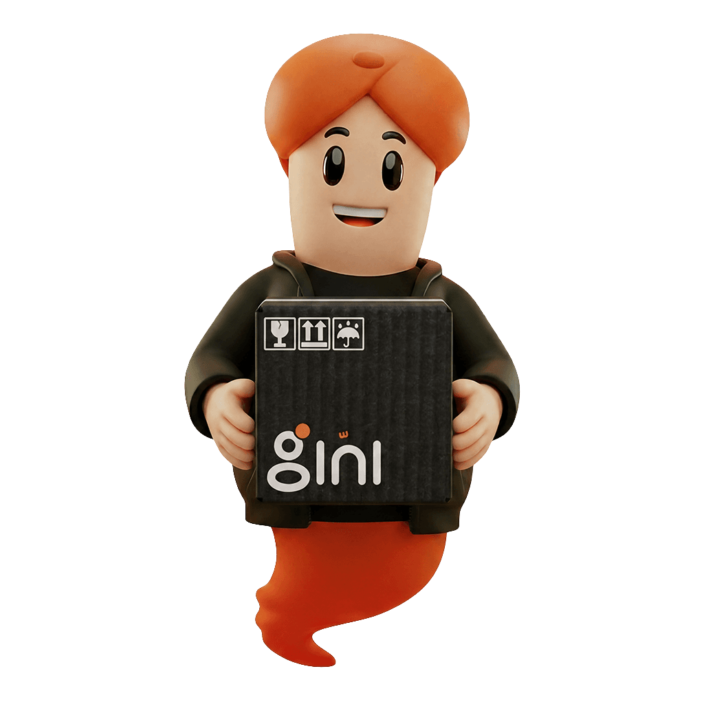
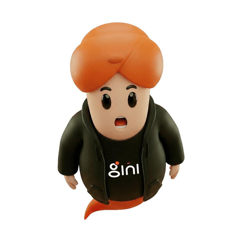
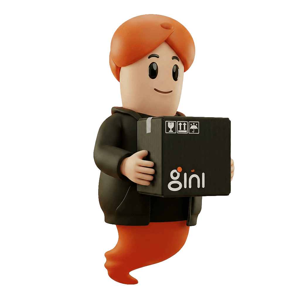
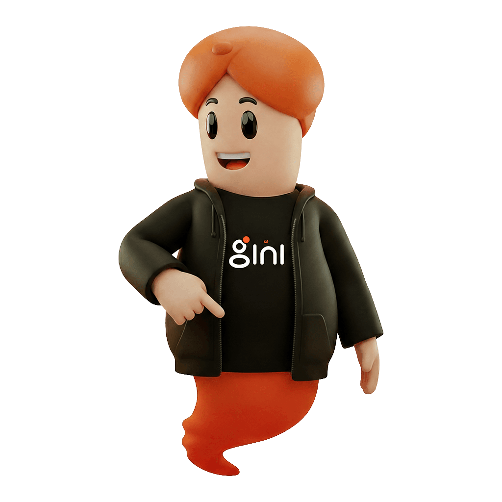
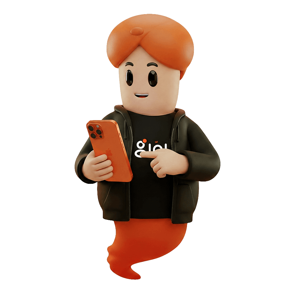
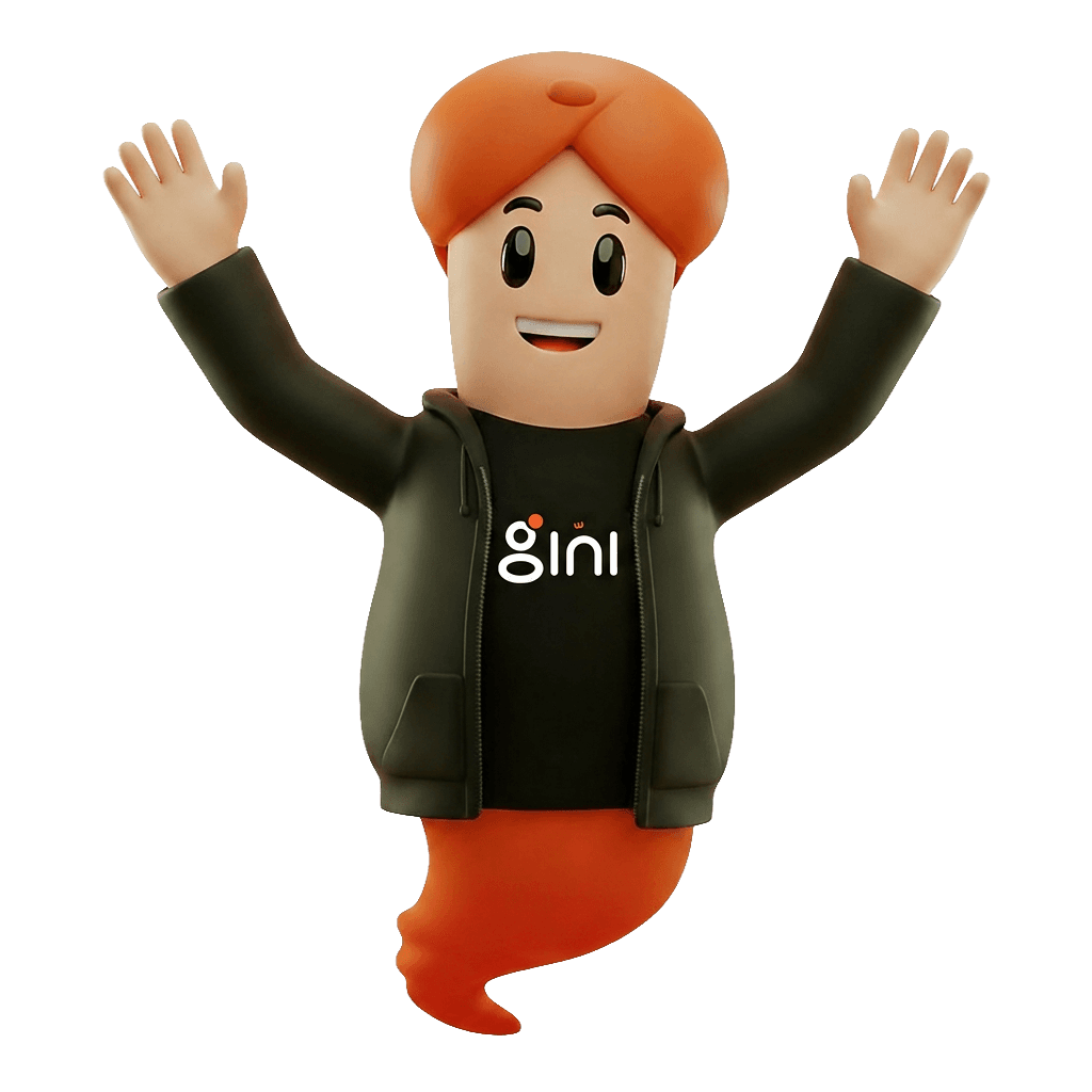
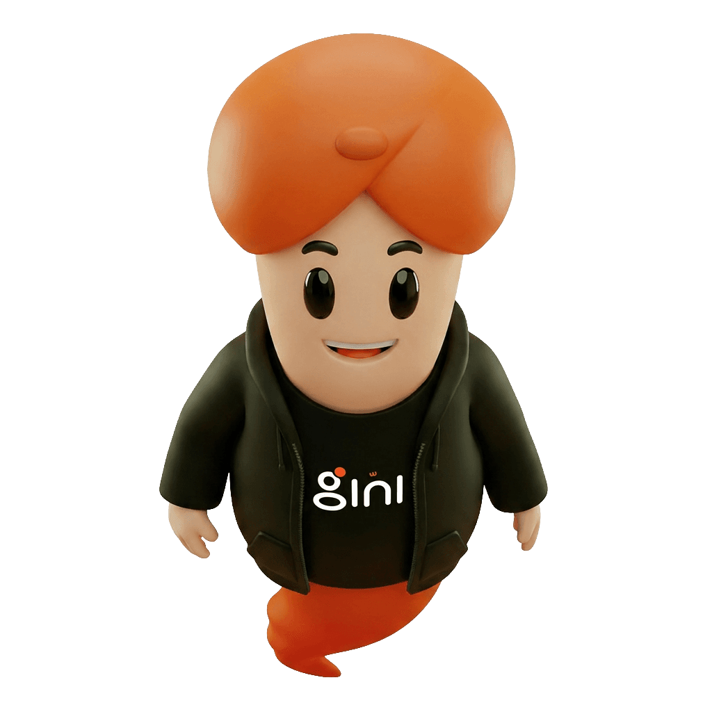
A 3D character in an orange quiff and a black hoodie — our way of making every GINI touchpoint feel warm, friendly, and unmistakably Iraqi.

42 / 42·Official character poses
GINI — Front
Front
GINI — Close-up
Close-up
GINI — Confident
Confident
GINI — Smile
Smile
GINI — Crossed Arms
Crossed Arms
GINI — Clapping
Clapping
GINI — Welcome
Welcome
GINI — Thinking
Thinking
GINI — Left View
Left View
GINI — Left Side
Left Side
GINI — Right View
Right View
GINI — Dutch Angle
Dutch Angle
GINI — Back Left
Back Left
GINI — Package
Package
GINI — Delivery Cap
Delivery Cap
GINI — Courier
Courier
GINI — Hand Up
Hand Up
GINI — Point Down
Point Down
GINI — Wave
Wave
GINI — Point Forward
Point Forward
GINI — Phone Two-Hand
Phone Two-Hand
GINI — Focused
Focused
GINI — Portrait
Portrait
GINI — Left Side 2
Left Side 2
GINI — Box Side
Box Side
GINI — Box One-Hand
Box One-Hand
GINI — Delivery Box
Delivery Box
GINI — Profile
Profile
GINI — Phone One-Hand
Phone One-Hand
GINI — Celebrate
Celebrate
GINI — Top Angle
Top Angle
GINI — Multi Packages
Multi Packages
GINI — Low Angle
Low Angle
GINI — Thumbs Up
Thumbs Up
GINI — Box Two-Hand
Box Two-Hand
GINI — Right Side 2
Right Side 2
GINI — Walking Box
Walking Box
GINI — With Box 2
With Box 2
GINI — Top View
Top View
GINI — With Box
With Box
GINI — Top Surprised
Top Surprised
GINI — With Box 3
With Box 3
How to use the mascot
Do
  • Place her on any surface — cream, white, or deep black — as long as the contrast stays clear.
  • Keep clear space around her at least equal to the head's height.
  • Pick the pose that matches the message — ad, notice, or story.
Don't
  • Don't recolour her — official palette only.
  • Don't swap her orange tail for another colour.
  • Don't use her smaller than 120px — detail breaks down.
13/16
Voice & tone

How we speak to our audience

Four traits guide every sentence we write — from ads to customer service replies.

01

Warm

We speak in plain language — close to our customers, true to the local culture.

02

Confident

We make promises we keep, and are honest about what we do and don't know.

03

Sharp

Short sentences, clear ideas. Every word earns its place.

04

Optimistic

We see the opportunity before the obstacle, and build tools that unlock the next step.

We say / We don't

  • We say

    We empower merchants to grow digitally — with integrated management, payments, and delivery tools.

    We don't

    The leading platform delivering an unparalleled shopping experience.

    Why: State what we do for merchants and consumers alike, don't claim leadership without proof.

  • We say

    We couldn't complete the payment. Try another card or contact us.

    We don't

    An error occurred while processing your request. Please try again later.

    Why: Explain what happened, then offer the next step. Never leave the customer in limbo.

14/16
For press

A ready-made description of GINI

Paste the paragraph below into your article or release as-is — or pull any of the quick facts directly.

Ready paragraph

GINI is an Iraqi market automation and digital commerce company founded in 2023, connecting merchants, service providers, delivery networks, and payment systems within a unified digital ecosystem. GINI provides tools for business management, product and service display, payment processing, and order management — enabling businesses and merchants to grow and reach millions of users efficiently. Headquartered in Baghdad, GINI serves merchants and consumers across every Iraqi province.
Quick facts
Legal name
GINI
Founded
2023
Headquarters
Baghdad, Iraq
Industry
Market automation & digital commerce
Website
gini.iq
Press contact
info@gini.iq
15/16
For developers

Adopt the GINI brand in one line

Every machine-readable artefact on this page is available at a stable URL. Pick a method, copy the line, paste into your project — or hand the URLs to Claude, Cursor, or v0 and they'll follow the brand automatically.
One lineZero dependencies7 endpoints
Pick an integration method7 methods
brand.csscss
/* globals.css */
@import url("https://gini.iq/brand.css");

/* That's it — every --gini-* token + shadcn alias is now available. */
.btn-primary {
  background: var(--gini-orange);
  color: var(--gini-cream);
}
Open

Editorial and approved-partner use only. For commercial co-branding email info@gini.iq.
16/16
FAQ

Answers to the questions we hear most

If you don't find what you're looking for, email info@gini.iq.

Can I use the GINI logo in an article or video about the company?
Yes. Editorial use (press, blogs, news) is permitted without prior approval, provided the logo is used as shown here — original proportions and colours.
I'd like to do a co-branded piece with GINI — what's the next step?
Email info@gini.iq with project details and a timeline. We usually respond within 24 hours with additional guidelines and co-branding assets.
Can I recolour the logo to match my own identity?
No. Only the official colours (GINI Orange or the white version) are permitted. Any recolouring is considered brand misuse.
Do you have high-resolution press photos?
Yes. Email info@gini.iq and we'll send a curated pack including product shots, team imagery, and HQ photography.
Are 'GINI' and the GINI wordmark registered trademarks?
Yes, both are trademarks owned by GINI. Avoid using either for similar product or company names that could create confusion.
For press

Need something we haven't listed? We're here.

Email info@gini.iq and we'll send custom imagery or a quote-approved statement within 24 hours.